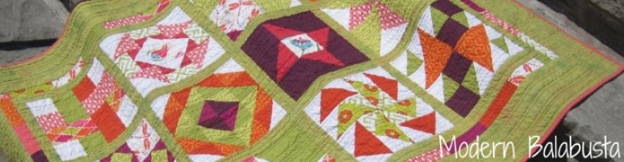
I've been unhappy with my blog template for a while now, but I lack the technical expertise to make the blog fancy like the pros, and I'm not willing to pay someone else to design a template either. I've made some initial changes and right now I'm struggling with my header. The issue is fitting the blog name into the photo of my Happy Melon quilt, which is the photo I want to use. My husband didn't like my first version:
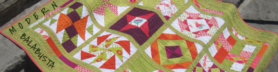
Version two inverts the photo (because Kivi thought it should flow from right to left) and places the blog name on the quilt itself. I don't like the green writing, but pink, white and black blended into the photo too much.
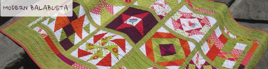
Kivi felt that a background behind the blog name would be helpful. Photobucket wouldn't let us do this, so we had to find an
app-for-that. Sadly, the one we found wouldn't allow me to make the font any larger than that in version three below.
So, people of the internet, I'm looking for your thoughts. Like any of these? Hate them all? Want to make something better for free for me (!!)? What say you?
Yummy quilt! :) Header 2 and 3 look more in focus for some strange reason but I do love the one you've got up at the moment! I need to do the same for my blog.
ReplyDeleteWell I really like what you have done so far... very fresh and clean looking. I like your current header, but since I have the screen zoomed in a bit closer to focus on the blog content - half of your header words are chopped off (hopefully that makes sense!), unless I scroll across to the right. I wonder how many other people would be the same?
ReplyDelete