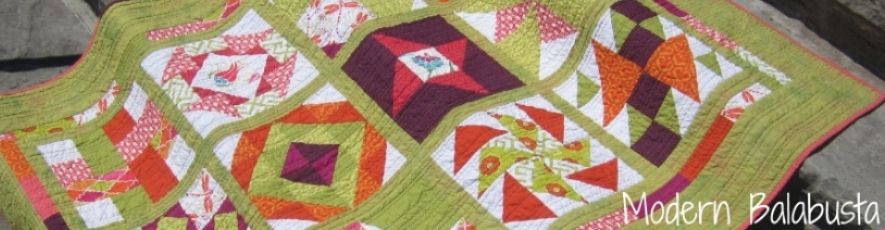
I've just finished my final block of Lila's Tula quilt and am working on my layout, which is proving to be a challenge. I want to alternate light and dark valued blocks, and I am short one light block. I thought I had a good variety, but several blocks are more "medium" than light or dark. I really don't want to make a new block, and honestly, I don't think I have enough of the solid fabric left to do it anyway. Here are my three top layouts:
The issue is the block in the bottom left corner. It needs to be "light" and well, it's not.
I'm leaning towards the layout in the first photo. Here it is in black and white:
What do you think? Good enough?


I think the first one if my favorite. It kind of highlights to octopus, which is my favorite element in that line.
ReplyDeleteI prefer the first setting too - I didn't notice the offending block until after I reading through the rest of the post and went back to look at the block. However, if you wanted to, you could try swapping the darks in the middle row - so that the darkest of the two darks sit adjacent to that medium block - after all, it is all about contrast. I usually try to put the blocks I like best in the middle, with blocks that are more stubborn to fit around the edges - if that is any help. Good luck!
ReplyDeleteFirst layout for the win.
ReplyDelete